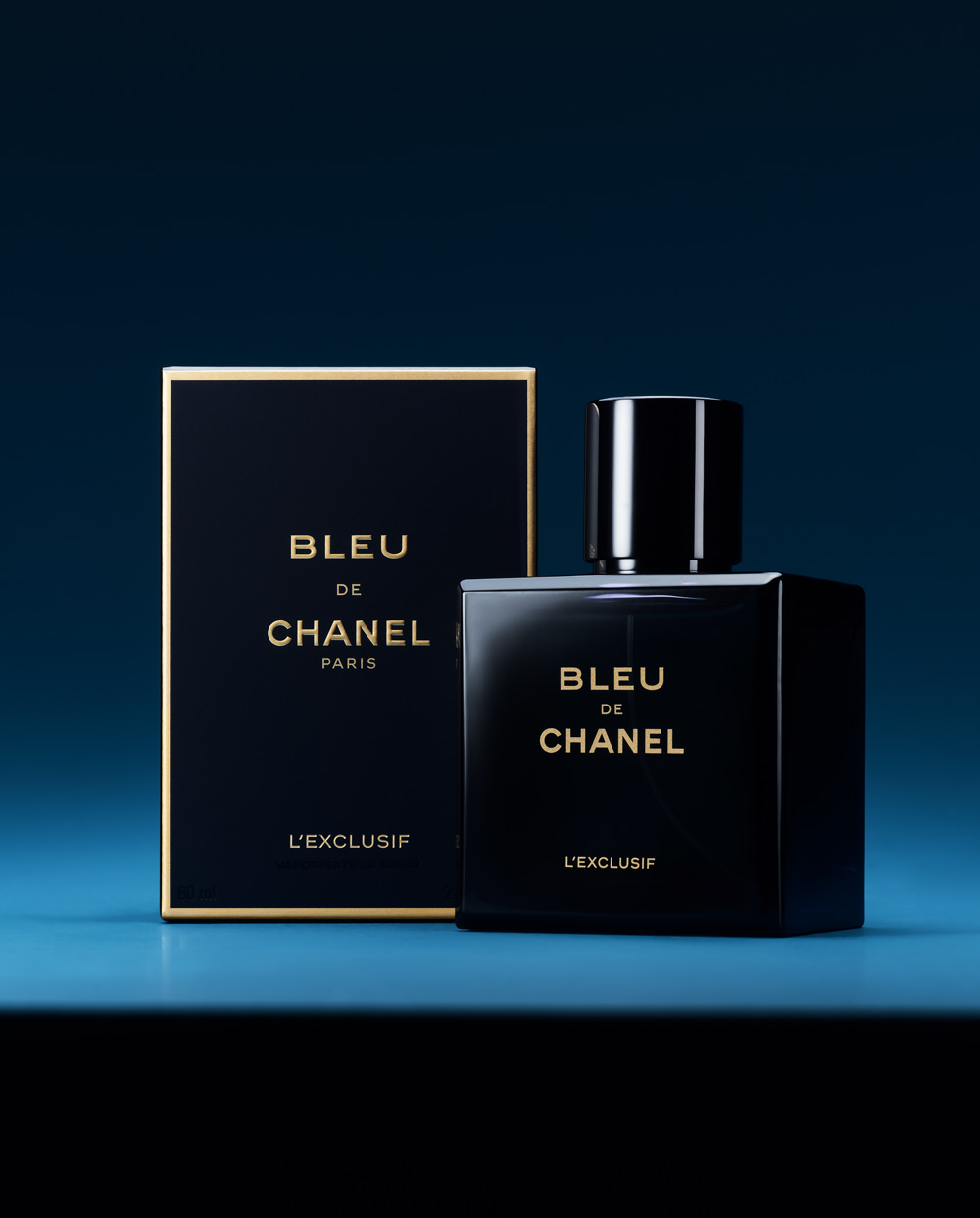
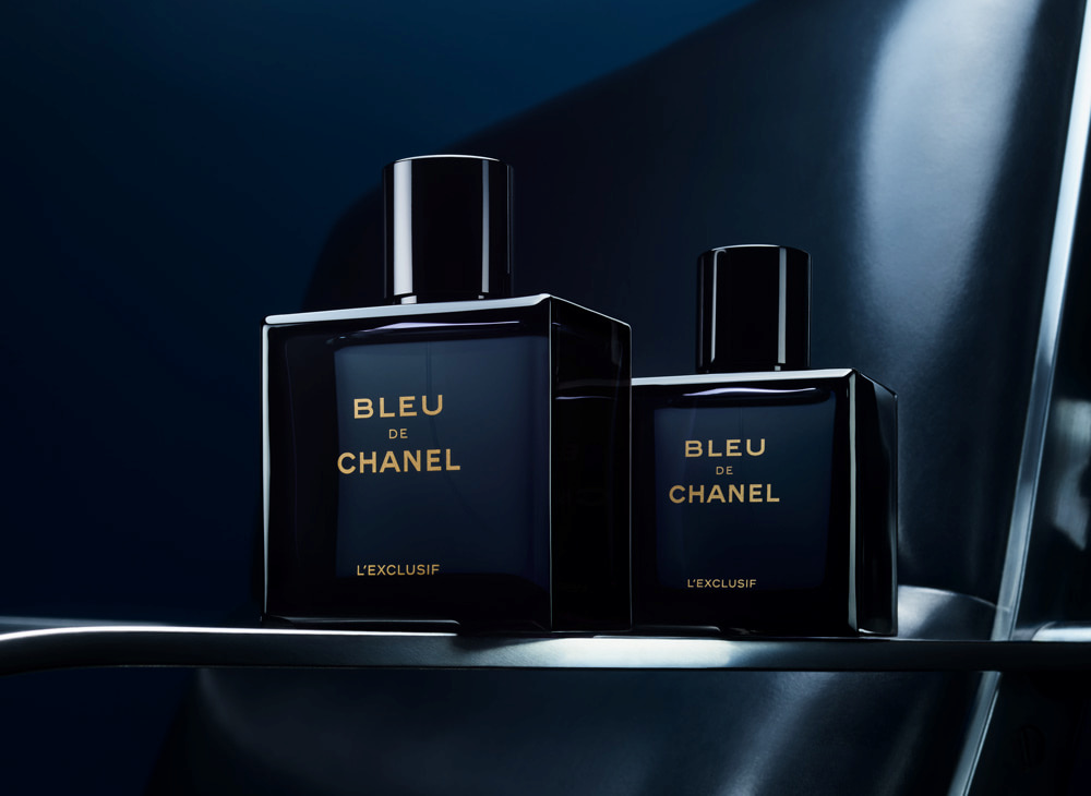
When BLEU DE CHANEL L’EXCLUSIF arrived, it did so with a bottle conceived in close dialogue with perfumer Olivier Polge, a scent approached with the rare intensity of an extrait and a design that had to make that power visible. For Sylvie Legastelois, Director of Packaging Creation and Graphic Identity at CHANEL Parfums/Beauté, the brief was clear: create a strong, specific form that signals concentration from the very first glance.
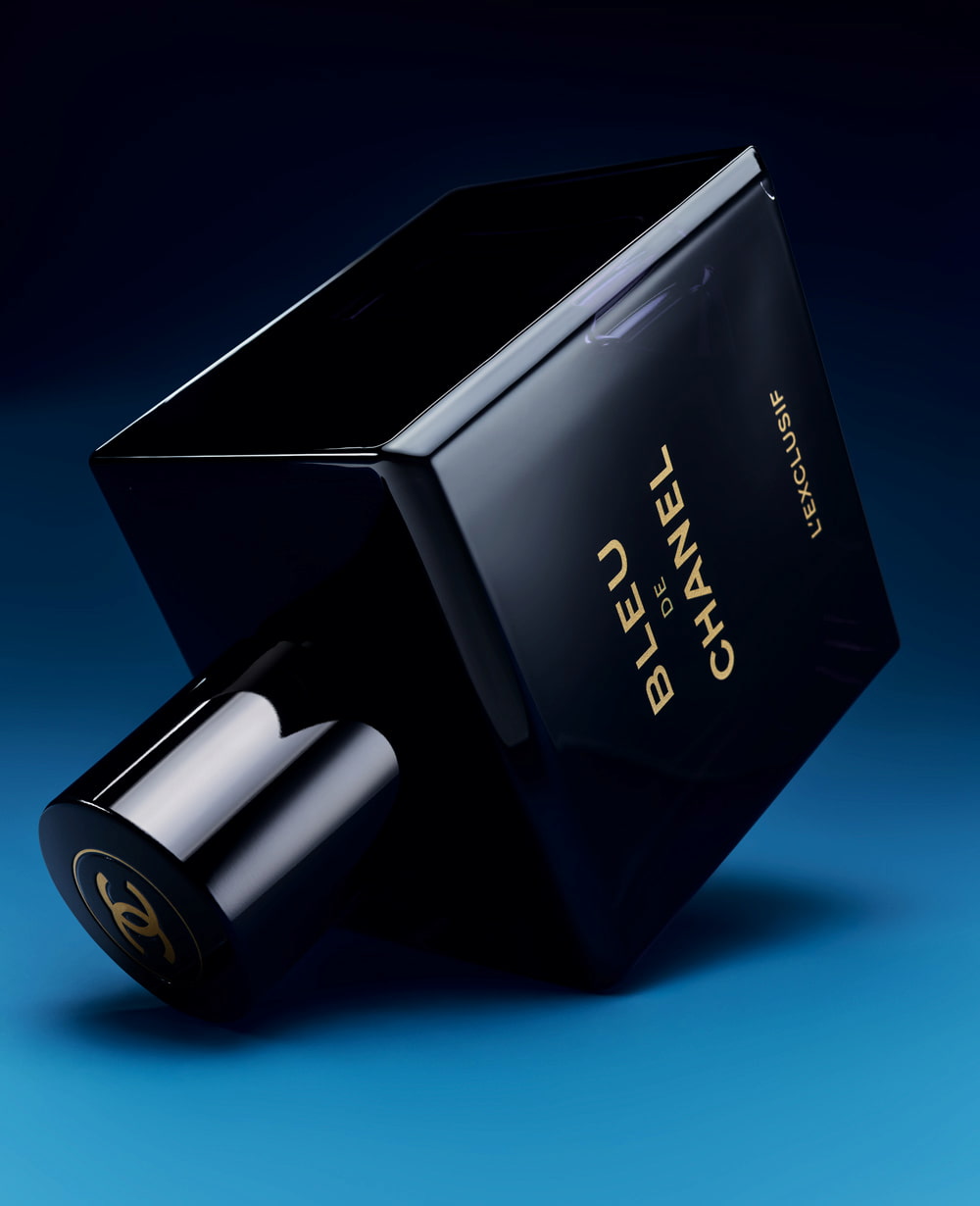
Sylvie Legastelois describes the silhouette as “inkwell-like,” a visual metaphor for density and depth. The result is a bottle that feels familiar yet entirely re-engineered: intrigue on first sight, discovery on second look. Its elevation depends on minute decisions — bevels and columns, the distribution of glass, even the base, or “marloquette.”
In her own words, “form reflects formula,” revealing the fragrance’s extraordinary intensity. Blue, meanwhile, is treated as a spiritual colour, mysterious, “too black to be blue, too blue to be black”, rooted in CHANEL archives yet resonant with the present. References drift from Soulages’ profound blues to the architectural rigour of Tadao Ando: volumes, materials, interior and exterior in perfect conversation.

Sylvie Legastelois – The Interview
The debut of BLEU DE CHANEL L’EXCLUSIF is accompanied by a new bottle. How did you work with Olivier Polge to bring it to life?
Olivier was deeply inspired by this project. And that’s important! Without inspiration, there is no fragrance. He approached BLEU DE CHANEL L’EXCLUSIF like a women’s perfume extract — with the same intensity. That’s unheard of for men’s fragrances. It aligned perfectly with the spiritual power of the colour blue. He went beyond what he had done for the original perfume. It’s an inspiring crescendo.
The scale of the challenge Olivier set for himself really charted the path for me. I told myself the bottle had to reflect the potency of this extract. We needed a specific bottle with a very strong shape and identity that would offer a clear visual expression of the fragrance’s concentration, since the name alone wouldn’t suggest it.
How would you describe this bottle?
The first comparison that comes to mind is an inkwell. And I really like that idea. The concentration of ink evokes the notion of intensity as well as the spiritual resonance of the words written with that ink. This image came about while sketching and designing the bottle, during my discussions with Olivier Polge.
This new fragrance is a complex composition, much like an extract. The overall impression is radical and intense. How do you translate that intensity into design?
I translated this sense of intensity through the idea of concentration. I wanted the design to be intriguing — for someone to initially think it’s the same bottle as before, and then realise, upon closer observation, that everything is different. I like when things aren’t immediately obvious, when everything doesn’t reveal itself at once.
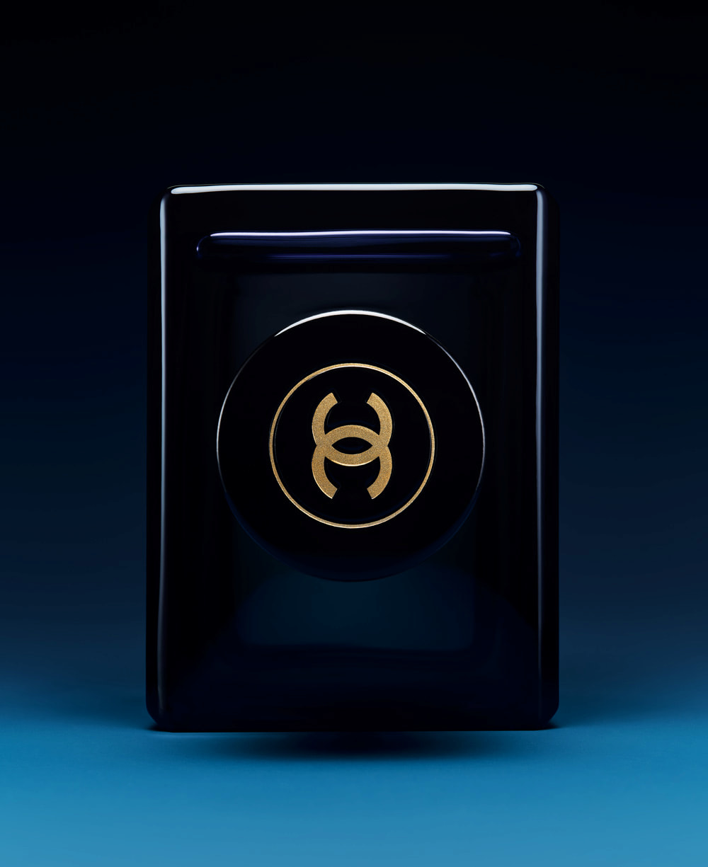
When trying to densify or intensify a form, you have to create a strong structure without letting the shape become heavy or overwhelming. It’s quite tricky to preserve the airy strength of a design — its elevation. You have to pay close attention to the bevels, the columns, the distribution of the glass, and the base of the bottle, which we call the “marloquette”. I believe that for BLEU DE CHANEL L’EXCLUSIF, form reflects formula, revealing on the outside the extraordinary intensity held within.


What does the colour blue represent to you and to CHANEL?
Blue is a spiritual colour. It has an indefinable quality. Is it blue? Is it black? “Too black to be blue, too blue to be black…” I love that versatility. Also, you can see in the archives that Gabrielle Chanel liked to mix navy blue and black. She appreciated that mysterious quality. In the 1930s, she created Bleu de CHANEL, just like Beige de CHANEL and Rouge de CHANEL. So this colour is fully legitimate. It’s part of our heritage.
The history of the colour blue is extensive. Which of its shades are evoked by BLEU DE CHANEL L’EXCLUSIF?
When I say that blue is a spiritual colour, I mean a colour without boundaries. It is naturally intense; it evokes the depths of the sea as well as the vastness of the sky. It is orientated towards the future. If red represents action, blue speaks more to projection. This colour reflects Gabrielle Chanel’s desire “to be part of what is going to happen”.

On the spectrum of blue, where does the bottle sit? Somewhere between Klein and Soulages?
Klein’s blue is full of energy and vitality. It’s something beyond a colour. It’s a dimension unto itself. This Bleu de CHANEL is closer to the blues of Soulages. Soulages is known for his “outrenoir”, but he also created blues of extraordinary intensity — deep and moving.
Is it a craft quite close to architecture? Would you say architecture is a source of inspiration for you?
Yes, I really admire Le Corbusier’s work, and I’m generally inspired by his masterful sense of volume. In this case, though, I would think more of the work of Tadao AndŌ, whom I admire greatly, particularly some of the houses he built in Japan — his way of composing with boxes, making volumes and materials interact, and playing with the relationship between interior and exterior.
How would you describe this fragrance in three words?
Concentrated, intense, sophisticated.
To Conclude,
Across BLEU DE CHANEL L’EXCLUSIF, Sylvie Legastelois shows how CHANEL’s design codes evolve by intensifying what matters. The bottle does not shout; it concentrates. It invites a double take, then rewards it through structure and proportion, a study in density without heaviness. Its chromatic language is equally purposeful: a spiritual blue that belongs to the House’s heritage while pointing forward, closer to Soulages than to spectacle, and tuned with an architect’s eye. Asked to define the fragrance in three words, she offers a fitting coda: concentrated, intense, sophisticated, a triad the object itself quietly embodies.
José Amorim
This article was created exclusively for LuxuryActivist.com. All content is protected by copyright. Images are used for illustrative purposes under fair use. If you own the rights to any image and wish it to be removed, please don’t hesitate to contact us, and we will act promptly.
