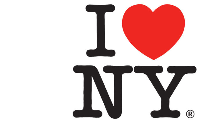
The “I Love NY” logo is one of the most iconic symbols of New York City, known worldwide for its simplicity and universal message of love for the Big Apple. Initially created in 1977 by graphic designer Milton Glaser, the “I Love NY” logo has become ubiquitous on t-shirts, caps, mugs, and other merchandise, with millions of items bearing the iconic design sold annually. However, the logo has been redesigned in recent years, which has sparked curiosity and controversy among design enthusiasts and New York City enthusiasts alike. Let’s take a closer look at the new redesign of the “I Love NY” logo, exploring changes in the font, the heart symbol, and the substitution of “I” with “We.”
Back to 1977…
Milton Glaser created the “I ♥ NY” logo in 1977 as part of a marketing campaign to promote tourism in New York City. The city faced various challenges at that time, including a high crime rate, economic difficulties, and negative perceptions due to the fiscal crisis of the 1970s. Glaser, a renowned graphic designer, was approached by the New York State Department of Commerce’s advertising agency, Wells Rich Greene, to develop a campaign to boost the city’s image and attract tourists.

Glaser’s goal was to create a simple, memorable design that would convey a positive message about New York City. He came up with the idea of using the iconic heart symbol (“♥”) as a universal symbol of love and combined it with the text “I NY” to represent “I love New York.” The design was an instant hit and has become one of the world’s most recognizable and iconic logos.
The “I ♥ NY” logo is widely recognized as a symbol of New York City and has been used on various merchandise, souvenirs, and promotional materials to promote tourism and celebrate the city’s culture, arts, and diversity. It has also been imitated and parodied in countless ways, showcasing its enduring popularity and cultural significance.
The American Typewriter font
One of the most noticeable changes in the redesigned “I Love NY” logo is the font. When Milton Glaser created the logo, he used the American Typewriter font,s a slab serif typeface designed by Joel Kaden and Tony Stan in 1974. The font has a distinctive vintage typewriter feel with square-shaped serifs and is often used to evoke a sense of nostalgia or retro aesthetic. The original logo featured a bold, blocky typeface with capitalized letters, giving it a bold and timeless look. However, the new redesign has opted for a more streamlined and modern font, with thinner lines and lowercase letters. The new font adds a sense of sleekness and contemporary appeal to the logo, making it more in line with current design trends while retaining its legibility and recognizability. Lowercase letters also create a sense of approachability and friendliness, making the logo more welcoming and inclusive.

the American Typewriter font has been used in other logos and designs. While it is most famously associated with the “I ♥ NY” logo, it has also been used in various contexts due to its distinctive vintage typewriter aesthetic. Here are a few examples:
- The band “The White Stripes” used American Typewriter as the font for their logo and album artwork, contributing to their retro and vintage-inspired branding.
- The movie “The Social Network,” a biographical drama about the founding of Facebook, used American Typewriter for its opening credits and promotional materials, adding a typewriter-like feel to reflect the film’s technology theme and innovation.
- The clothing brand “Ralph Lauren” has used American Typewriter in some designs, particularly in its “RL Vintage” collection, which features vintage-inspired graphics and typography.
- The fashion brand “Tommy Hilfiger” has also used American Typewriter in its designs, particularly in its “Tommy Jeans” collection, which often incorporates retro and vintage elements.
The Heart is about love.
The heart symbol is the centrepiece of the “I Love NY” logo, representing the universal language of love and people’s emotional connection with New York City. In the original logo, the Heart was rendered in a bold, solid red colour, with a slight tilt to the right, giving it a sense of dynamic movement. Milton Glaser’s decision to replace the word “love” with a heart symbol (“♥”) in the “I ♥ NY” logo was a creative and strategic design choice.

- Simplicity and Memorability: Using a heart symbol in place of the word “love” made the logo simpler and more memorable. The heart symbol is a widely recognized and universally understood symbol of love, which allowed Glaser to convey the intended message concisely and visually appealingly. The simplicity of the design made it easy to reproduce and recognize, contributing to its widespread popularity and success.
- Visual Impact: The heart symbol has a strong visual impact and emotional association with love, which helped the logo stand out and grab attention. The bold, red Heart in the “I ♥ NY” logo is instantly recognizable and creates an emotional connection with the viewer, evoking positive feelings and associations with New York City.
- Universal Appeal: The heart symbol transcends language and cultural barriers, making the logo universally appealing. By using a heart symbol, Glaser created a design that could be understood and appreciated by people of different backgrounds, languages, and cultures, making it a powerful and inclusive symbol for promoting New York City as a tourist destination.
- Branding and Marketing: Using a heart symbol in the “I ♥ NY” logo also helped create a distinctive brand identity and marketing campaign for New York City. The logo became a recognizable and memorable city symbol, instantly conveying a positive message of love and affection for New York. The logo’s success has also led to its widespread adoption of various promotional materials, merchandise, and souvenirs, further reinforcing the brand image and promoting tourism in New York City.
Glaser’s decision to replace the word “love” with a heart symbol in the “I ♥ NY” logo was a creative and strategic choice that contributed to the logo’s simplicity, memorability, visual impact, universal appeal, and branding effectiveness.
However, the Heart has been given a more refined and polished look in the redesigned logo. The Heart is now outlined in a thin, clean line with a subtle gradient fill that gives it a sense of depth and dimensionality. The tilt of the Heart has also been adjusted to be more upright, creating a sense of stability and balance. The new Heart retains the essence of the original design while giving it a fresh and contemporary twist.
Change from “I” to “We”
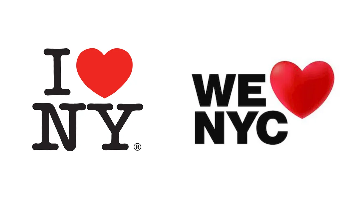
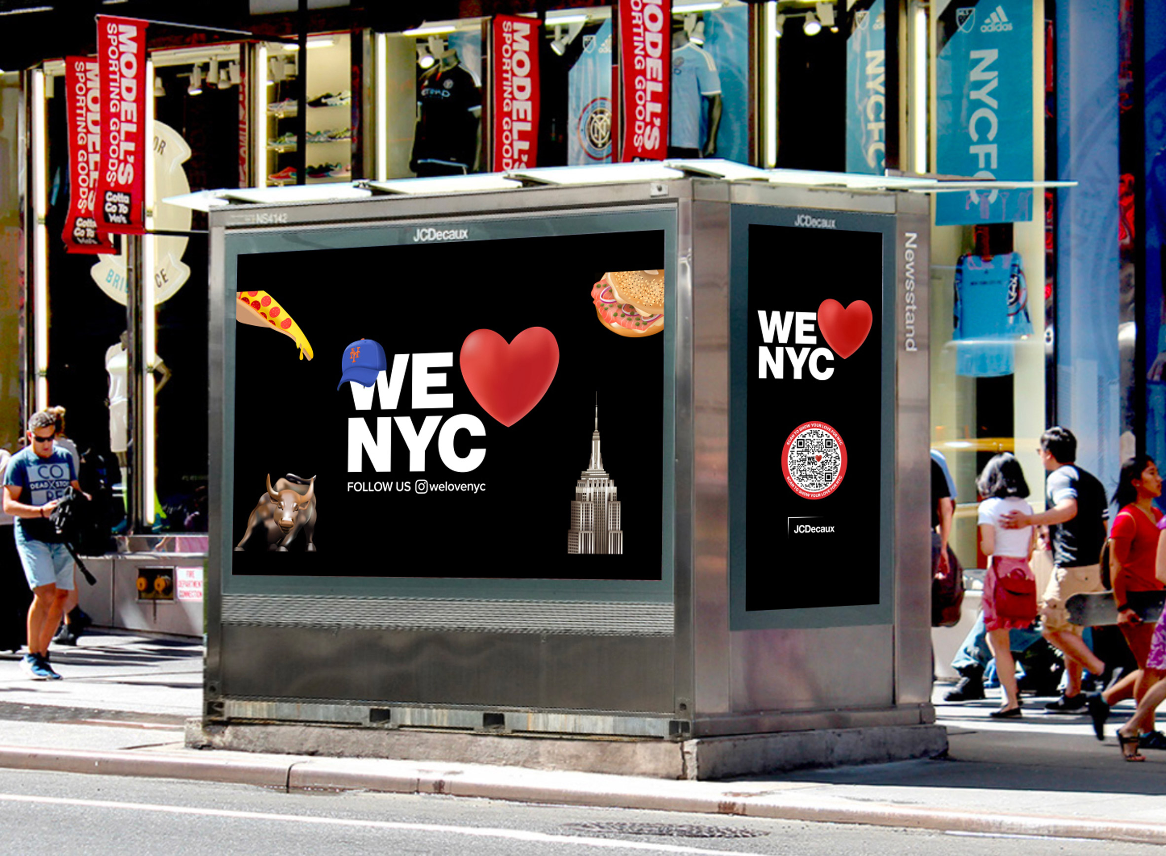
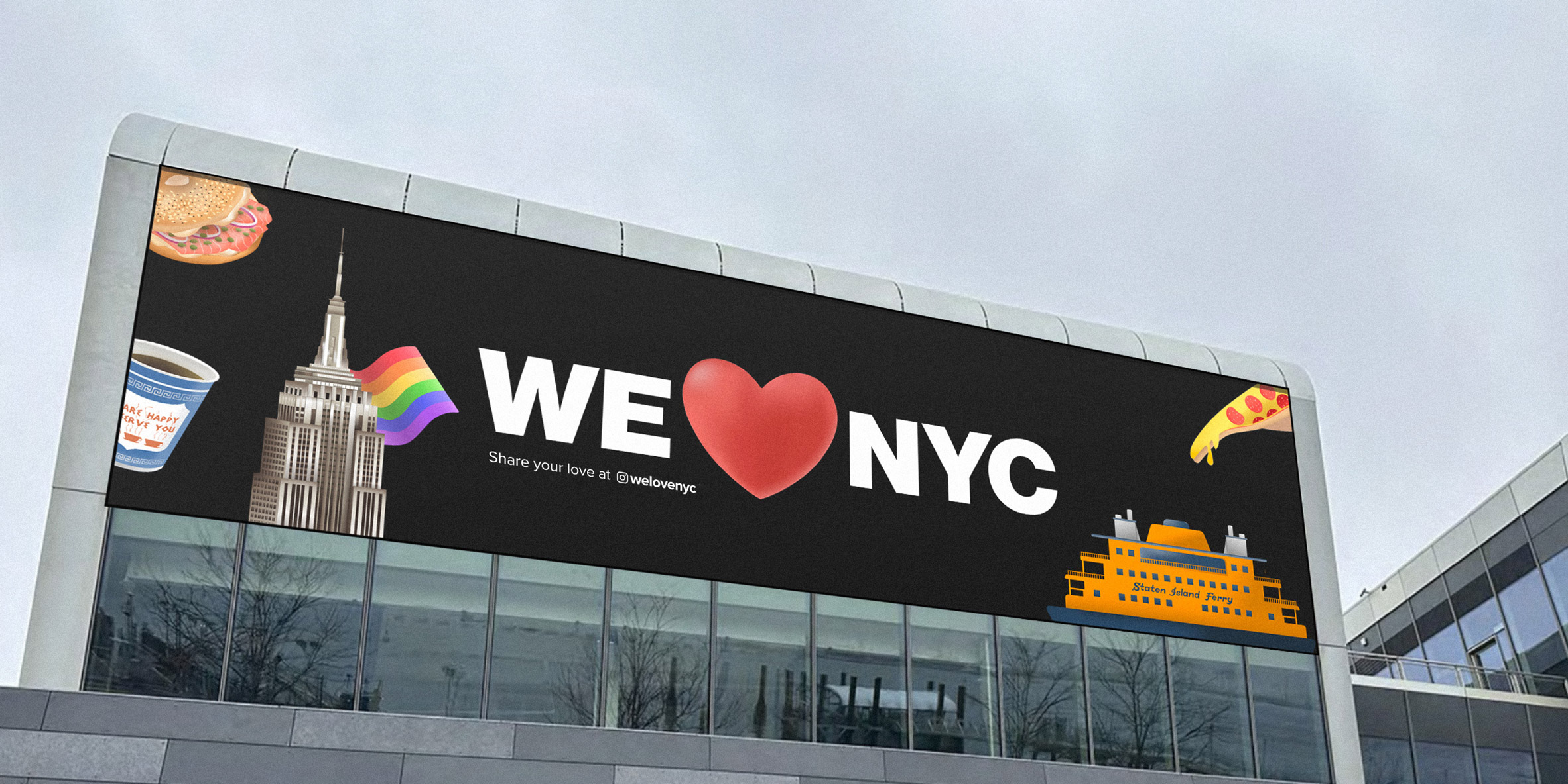
Perhaps the most significant change in the redesigned “I Love NY” logo is the substitution of “I” with “We.” In the original logo, the “I” represented the individual, expressing a personal love for New York City. However, in the redesign, the “I” has been replaced with “We,” signifying a collective love and inclusivity. This change reflects the evolving social and cultural landscape, where a sense of community, diversity, and unity is increasingly emphasized. The ” We ” logo conveys a message of togetherness and inclusiveness, inviting people from all walks of life to share in the love for New York City. It also aligns with the city’s spirit of resilience and unity in the face of challenges, such as the COVID-19 pandemic and social justice movements, making the logo more relevant and resonant with the current times.
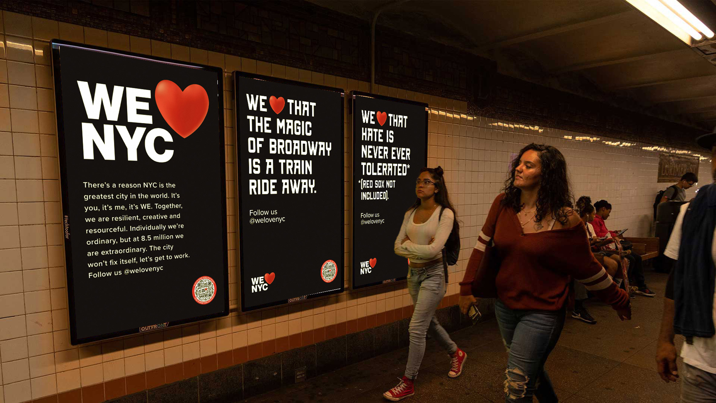
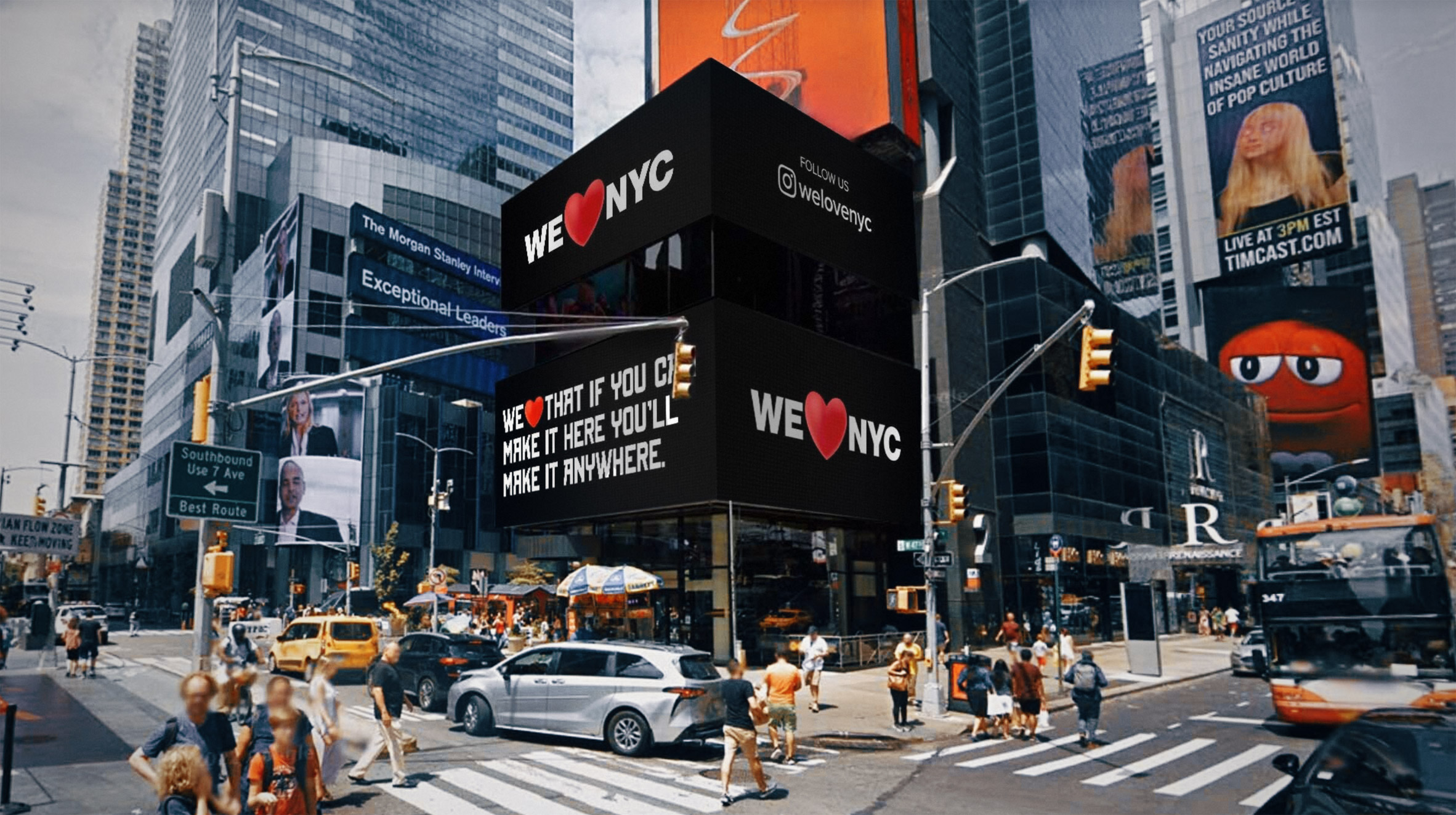
To summarize it,
The redesign of the “I Love NY” logo has generated excitement and debate among design enthusiasts and New York City enthusiasts. While some may have nostalgic attachments to the original logo, the new redesign brings a fresh and contemporary twist to the iconic symbol. The changes in the font, the Heart, and the substitution of “I” with “We” all contribute to a modern and inclusive look, aligning with current design trends and reflecting the evolving social and cultural landscape. The new logo retains the essence of the original design while adding a sense of approachability.
José Amorim
Information sourced by the author for luxuryactivist.com. All content is copyrighted with no reproduction rights available. Images are for illustration purposes only.
