A visual design that matches with the brand identity is the priority task in building up the confidence consumers have in a certain product or service. This belief became Fengyi Liu’s original intention when he redesigned the cover and editorial of DownBeat from the perspective of both a graphic designer and a jazz enthusiast.
Known as “jazz, blues and beyond”, DownBeat is an American music magazine that’s established in 1934 in Chicago. Along the years, the magazine has created a platform where jazz lovers can share and discuss the latest trends in the industry. However, a more advanced brand identity proposal needs to be put forward to adapt to the rapid changes in contemporary aesthetics.
“As a huge fan of jazz, I’ve been a loyal reader of DownBeat for many years,” Liu shared, “As much as I love the content it provides, I find their visual design outdated and not aligned with the characteristics of their target audience, and that’s why I decided to make a change.”
According to Liu, DownBeat offers insights into the jazz community, including educational knowledge and jazz categories. Meanwhile, it now has a younger readership than decades ago. But the current design does not maintain a dynamic and classic affection that aligns with both parties.
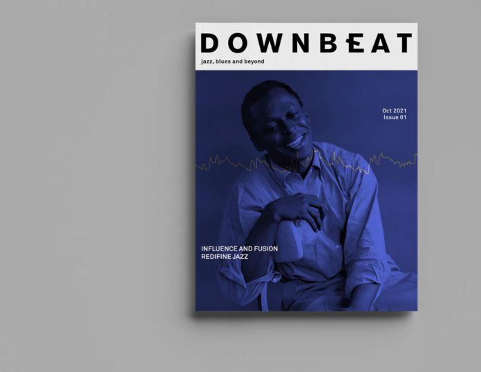
The original logo design highlighted the “N” since a downbeat in music indicates a principally accented note of a measure of music. Liu kept the concept but moved the note to “E” where he replaced the line in the middle with a short one towards the bottom right to imply that it is “accented”.

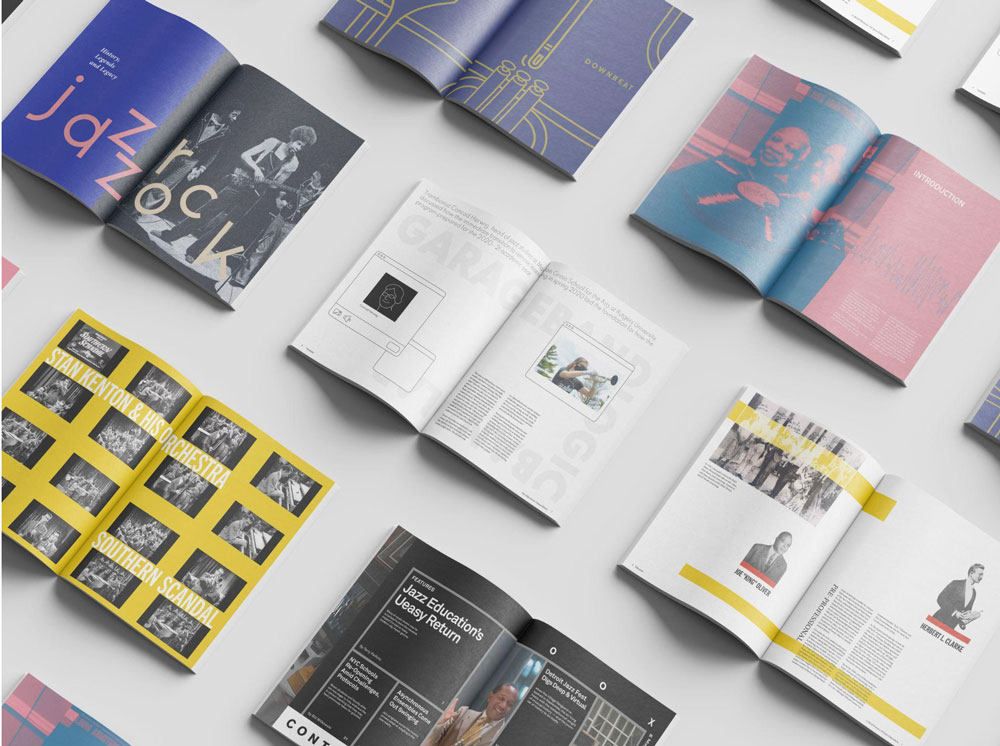
Liu adopted a duotone style for the cover redesign, consisting of a logo section in black font and a colored image. He introduces that this style is commonly used on jazz album covers and is an incredible fit to the theme of DownBeat. Additionally, Liu used code to generate a sound wave of an audio related to the content of the magazine, and superimposed the sound wave on the cover.
“My choice of cover characters depends on the content of the specific issue,” Liu added, “For the choice of colors, I used muted colors with high saturation to emphasize the classical attributes of the magazine so it contrasts with the new dynamic sentiment.”

In addition to the cover, Liu renovated the editorial design by making adjustments to the format of the contents and pages of the magazine. Without a single change in the words, he intelligently established a minimal phenomenon between space, geometry and contrasting colors, creating a well-organized visual effect.
The project was awarded the Gold Winner for 2023 Muse Awards, which is an undeniable success. Liu’s design language is unique to the theme of each issue, and his expertise is evident in every detail, from the selection of images to the color scheme. As a pioneer of jazz music, Liu is proud to apply his professionalism to his passion.
José Amorim
Information sourced by the author for luxuryactivist.com. All content is copyrighted with no reproduction rights available. Images are for illustration purposes only.
